Certain colors tend to create particular emotional associations, and businesses use those associations strategically to influence how products and brands feel before customers consciously analyze them.
Color influences people far more than they usually realize. Before consumers read a slogan, compare features, or evaluate pricing, their brains already begin forming emotional impressions, partly based on color alone.
Brands understand this extremely well.
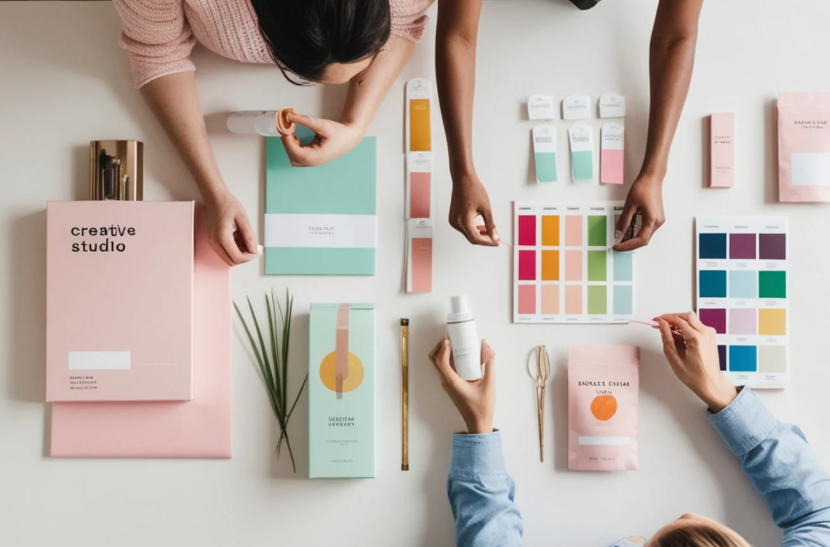
Companies carefully choose colors for logos, packaging, advertisements, websites, restaurants, products, and retail spaces because color shapes perception, attention, emotional tone, and purchasing behavior in subtle but measurable ways.
While color psychology is not perfectly universal, patterns consistently emerge across marketing and design.
Color Creates Instant Emotional Impressions
The human brain processes visual information rapidly, and color is often one of the first details people notice.
Different colors trigger different emotional expectations based on biology, cultural conditioning, and repeated experience.
Warm colors such as red, orange, and yellow often feel energetic, urgent, stimulating, or emotionally intense. Cooler colors like blue and green tend to feel calmer, more trustworthy, or more stable.
These reactions happen quickly and often subconsciously.
This is why color plays such an important role in branding. Companies want consumers to emotionally “feel” certain qualities immediately before rational evaluation even begins.
A luxury brand may emphasize black and gold to communicate sophistication. A health-focused company may use greens and earth tones to signal freshness and wellness.
Color becomes emotional shorthand.
Read The Science of First Impressions for more on fast visual judgment.
Red Is Often Used for Energy and Urgency
Red is one of the most psychologically powerful colors in marketing because it naturally attracts attention.
The color is strongly associated with energy, excitement, urgency, appetite, and emotional intensity. Fast-food brands frequently use red because it stimulates attention and can increase feelings of excitement and activity.
Retailers also use red heavily during sales promotions because it psychologically conveys urgency and action.
However, red can create very different effects depending on context. In some settings, it signals passion and excitement. In others, it may imply danger, aggression, or warning.
Marketers carefully balance these associations depending on the emotional atmosphere they want consumers to experience.
Blue Became the Color of Trust
Blue is one of the most commonly used corporate colors because people often associate it with stability, calmness, professionalism, and reliability.
Banks, technology companies, healthcare organizations, and social platforms frequently rely on blue branding because it tends to evoke trust and security.
Unlike more emotionally intense colors, blue usually feels emotionally controlled and dependable.
This makes it particularly effective for industries where credibility matters heavily.
Blue also performs well digitally because it remains visually comfortable for extended screen viewing. This partly explains its widespread use across websites, apps, and online platforms.
The emotional neutrality of blue became highly valuable in modern branding environments.
Explore How Everyday Products Are Designed to Feel Familiar for more on trust and design.
Green Suggests Nature, Health, and Balance
Green often carries strong associations with nature, growth, freshness, and environmental awareness.
Brands focused on wellness, sustainability, health, or organic products frequently use green because it visually reinforces those themes.
Green can also create calming emotional effects because people commonly associate it with natural environments and balance.
Financial companies sometimes use green as well because the color connects symbolically to money, stability, and growth in many cultures.
Importantly, shades matter. Bright greens may feel energetic or youthful, while darker greens often communicate sophistication or environmental seriousness.
Small tonal changes can significantly alter emotional interpretation.
See The Psychology Behind Internet Trends for more on subtle digital influence.
Black and White Shape Perceptions of Simplicity and Luxury
Black often communicates sophistication, exclusivity, authority, or elegance in branding and marketing.
Luxury fashion brands frequently rely on black because it creates a strong visual contrast while feeling refined and controlled.
Minimalist branding also uses black heavily because it reduces visual clutter and emphasizes clarity.
White works differently. It often signals cleanliness, simplicity, openness, or modernity.
Technology brands frequently use white space extensively because it conveys a sense of efficiency and focus.
The combination of black and white remains especially powerful because it creates visual contrast while maintaining emotional simplicity.
Minimalist design trends rely heavily on these psychological effects.
Color Psychology Is Influenced by Culture and Context
While many color associations appear common, color psychology is not entirely universal.
Different cultures may attach different meanings to colors based on history, symbolism, and tradition. Personal experiences also shape individual emotional reactions.
Context matters enormously as well.
A color that feels calming in one environment may feel cold or distant in another. Bright colors may feel playful for children’s brands, but overwhelming for luxury products.
Effective marketing uses color strategically alongside typography, imagery, layout, and messaging rather than relying on color alone.
Color influences perception powerfully, but it works best as part of larger emotional design systems.
Check Why Certain Aesthetics Suddenly Explode Online for more on visual trends.
Marketing Uses Color to Shape Behavior Quietly
One reason color psychology feels so powerful is that its effects often operate below conscious awareness.
Consumers may believe they are responding purely to product quality or rational preference, while color quietly influences emotional interpretation in the background.
Packaging that appears healthier, stores that feel calmer, websites that seem more trustworthy, or advertisements that feel more exciting often rely heavily on strategic color design.
The goal is not usually manipulation in an obvious sense. Instead, marketers use color to reinforce emotional associations already connected to products or brand identity.
The hidden psychology of color reveals how deeply visual perception shapes decision-making.
Before people consciously decide what they think about a brand, color often helps determine how the brand feels first.